Introduction
Want your bathroom to look polished and put together—but not sure how to match colors? This guide will teach you how to create a cohesive bathroom color palette step by step. Whether you’re working with a small powder room or a full master bath, choosing the right colors makes a huge difference. A unified color scheme brings harmony, style, and a sense of calm to one of the most frequently used rooms in your home.
Why a Cohesive Bathroom Color Palette Matters
The bathroom is where you start and end your day. When the colors clash or feel disorganized, it can make the space feel chaotic or cramped. A cohesive palette makes everything look intentional—from towels to tile to paint—and enhances both design and relaxation.
A strong color palette also helps with:
- Creating a spa-like feel through harmony and flow
- Making small spaces appear larger and brighter
- Simplifying decor and shopping decisions
- Boosting home value by making the space feel well-designed
Whether you love soft neutrals, moody tones, or modern contrasts, the right palette pulls it all together.
Step-by-Step Guide to Creating a Cohesive Bathroom Color Palette
1. Identify the Mood You Want
Start by deciding how you want your bathroom to feel:
- Calming and clean: Use soft blues, whites, grays, or greens
- Modern and bold: Try black, white, and brass or deep jewel tones
- Warm and earthy: Look to taupes, terracotta, cream, and wood tones
- Fresh and bright: Use whites with pops of pastel or citrus tones
Think about how the bathroom fits with the rest of your home’s design. If your house is minimalist or coastal, your bathroom should flow with that theme.
2. Choose a Base Color
Your base color will cover the most space—usually the walls or main tiles:
- Whites and light neutrals work well for a clean, airy backdrop
- Gray, beige, or greige are versatile and warm
- Pale blues or soft greens add color without overpowering
- Charcoal or navy can create contrast in larger spaces
Stick with soft or muted tones unless you’re confident working with bold design.
3. Select 1–2 Accent Colors
Accent colors add personality and help break up the base tone:
- Pick one medium-tone and one darker or brighter color
- These can show up in towels, rugs, soap dispensers, cabinets, or even tile patterns
- Popular combinations include:
- Gray base + navy + wood
- White base + black + gold
- Beige base + sage green + matte black
- Soft blue base + white + sand
Tip: Use the 60/30/10 rule:
- 60% base color
- 30% secondary/accent
- 10% bold accent or pop
4. Add a Neutral or Metallic
Neutrals help balance brighter tones, and metallics add a sleek finish:
- Chrome, brass, matte black, or brushed nickel fixtures unify the palette
- Natural textures like wood or stone bring warmth to any scheme
- Choose one dominant metal and stick to it across all hardware for consistency
Note: Don’t mix too many metal finishes—it disrupts cohesion.
5. Use Paint Swatches and Samples
Never rely solely on digital images or memory:
- Get actual paint swatches or color sample cards from the store
- Tape them to your bathroom walls and observe at different times of day
- If you’re updating tile or cabinets, bring a sample to match against
- Consider sample-size paint pots and test small sections on the wall before committing
Lighting tip: Bathroom lighting often alters how colors look—test under both daylight and artificial light.
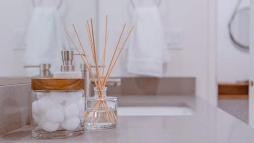
6. Coordinate Decor and Accessories
Once your base palette is set, extend it to smaller details:
- Choose towels, rugs, and shower curtains that match or complement your palette
- Avoid bold prints or random colors that break your theme
- Use storage baskets, trays, or jars in consistent materials and shades (e.g., all wood, all white ceramic)
Optional: Add greenery or one standout piece of wall art in your accent color for a subtle pop.
7. Repeat Key Colors for Balance
Repetition creates cohesion and flow:
- If your accent color is navy, use it in at least 2–3 places (e.g., towels, cabinet handles, artwork)
- Repeating colors across vertical and horizontal planes (walls and floors) makes the space feel intentional
- Try to echo the same color intensity throughout for a balanced look
Tip: Avoid having just one item in a bold color—it can feel out of place.
Common Mistakes to Avoid
Mistake 1: Using too many colors
Solution: Stick to 2–3 main colors max. More than that creates visual clutter.
Mistake 2: Ignoring undertones
Solution: Match undertones across your palette—cool with cool, warm with warm.
Mistake 3: Over-relying on trends
Solution: Choose colors you genuinely love, not just what’s popular.
Mistake 4: Mixing metal finishes
Solution: Pick one metal finish (like brushed nickel or matte black) and use it consistently.
Mistake 5: Forgetting to test colors in real light
Solution: Always view swatches in your actual bathroom lighting before committing.
Extra Tips & Bathroom Hacks
- Use peel-and-stick samples for tile and wallpaper to test patterns easily
- Coordinate with grout color if you’re installing new tile—it can make or break your palette
- Paint the ceiling a soft version of your base color for added depth
- Want to organize your new look? Check out our guide on how to create a bathroom storage system that fits your theme
Conclusion
Creating a cohesive bathroom color palette isn’t just about matching paint—it’s about creating a calm, coordinated space where every element works together. Choose a base color, add complementary accents, and stick to a few consistent tones for a polished, intentional look. Whether you prefer neutral elegance or vibrant contrast, the right color palette makes your bathroom feel like a peaceful retreat.
🎨 Bookmark this guide and return to it every time you plan a bathroom refresh or remodel.